Come Sit With Us: A Dining Room Glow-Up
During our walk-through of the house, I was immediately drawn to the dining room. Perfectly placed between our galley kitchen and large entry way, I knew it had potential to connect both spaces more fluidly. I decided this would be the first room to tackle… of course after I finished painting the kitchen trim, our bedroom trim and as it turns out, the TV room.
As mentioned in my introduction post, our cottage is begging for pigment. When we moved in, every wall and piece of trim in the home was white. Not to say I plan to paint everything, but our house could definitely benefit from a little color.
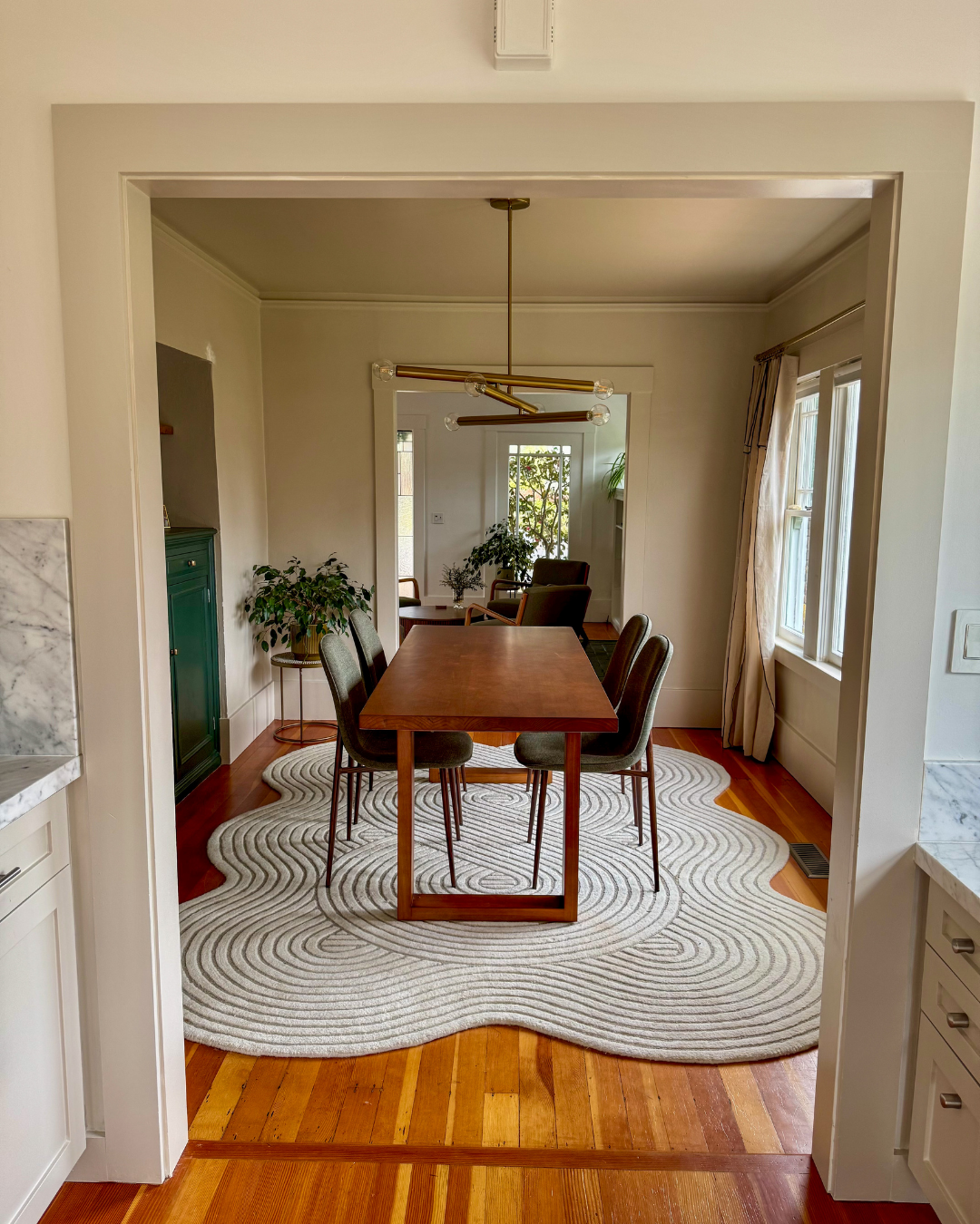
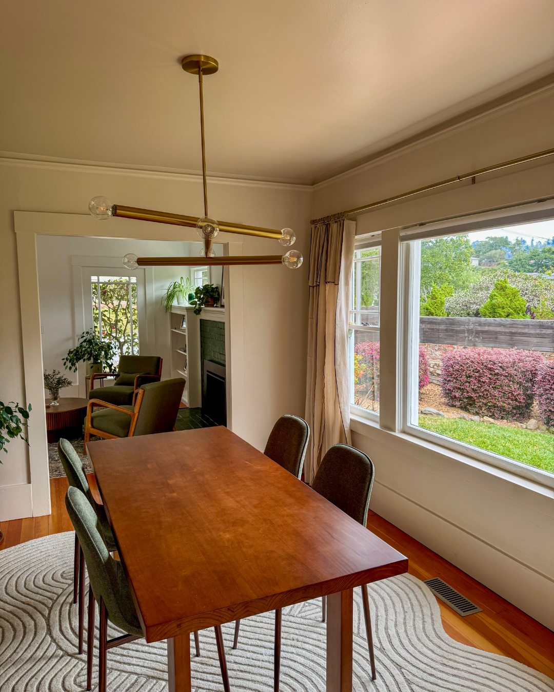
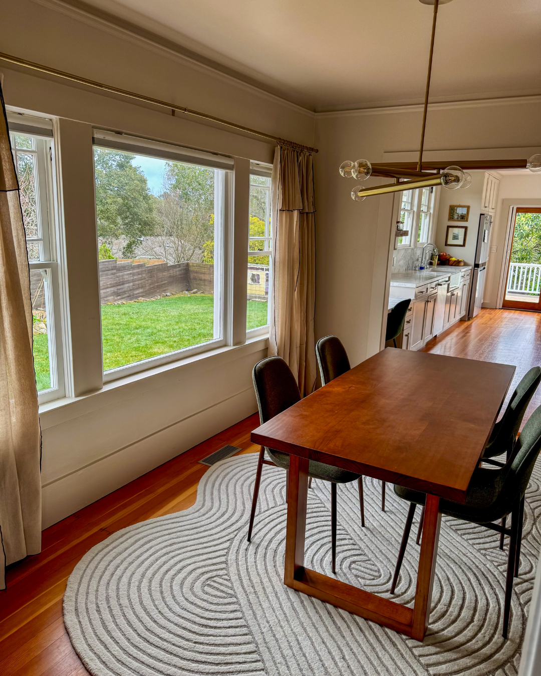
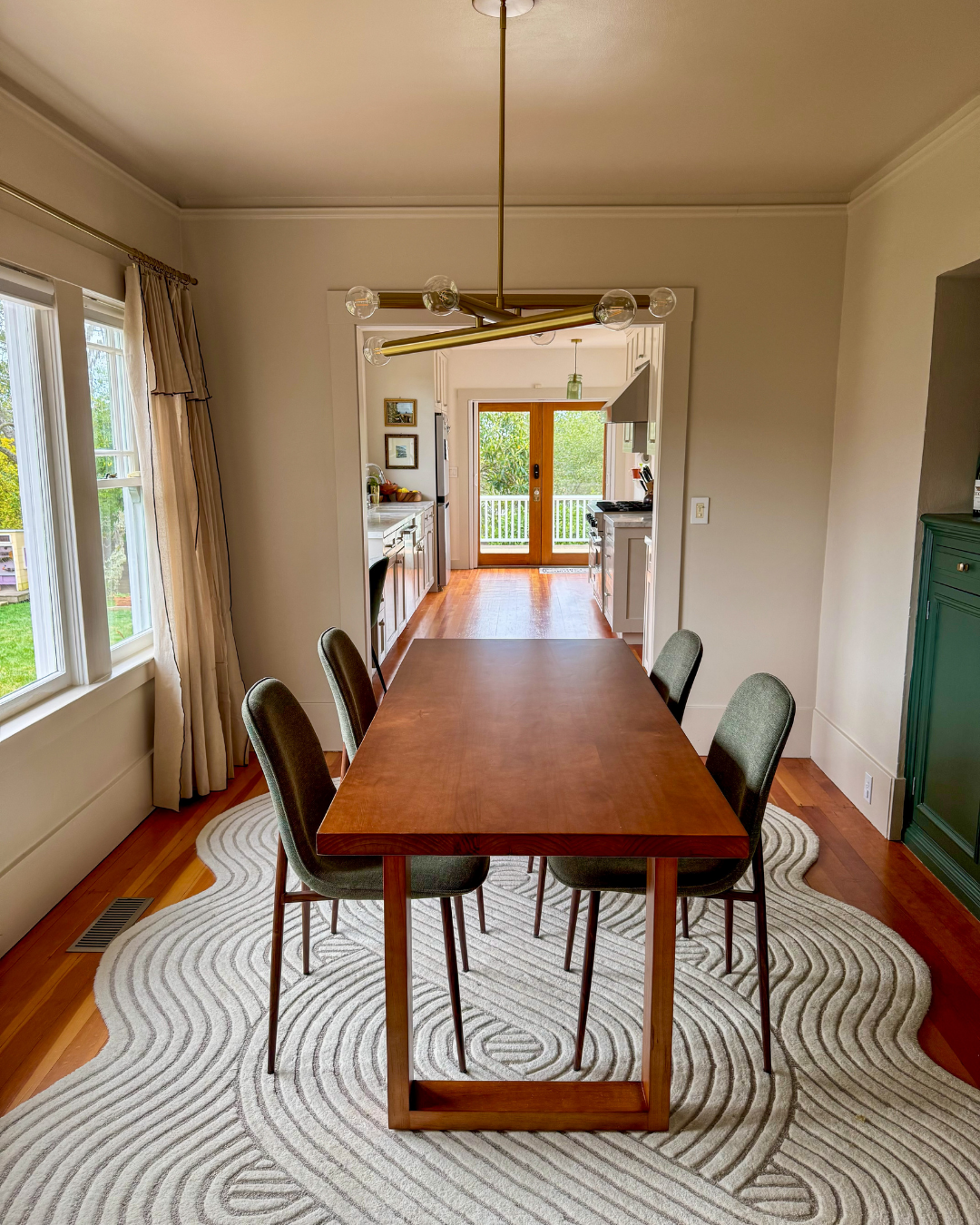
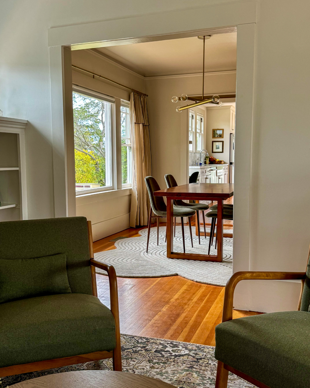
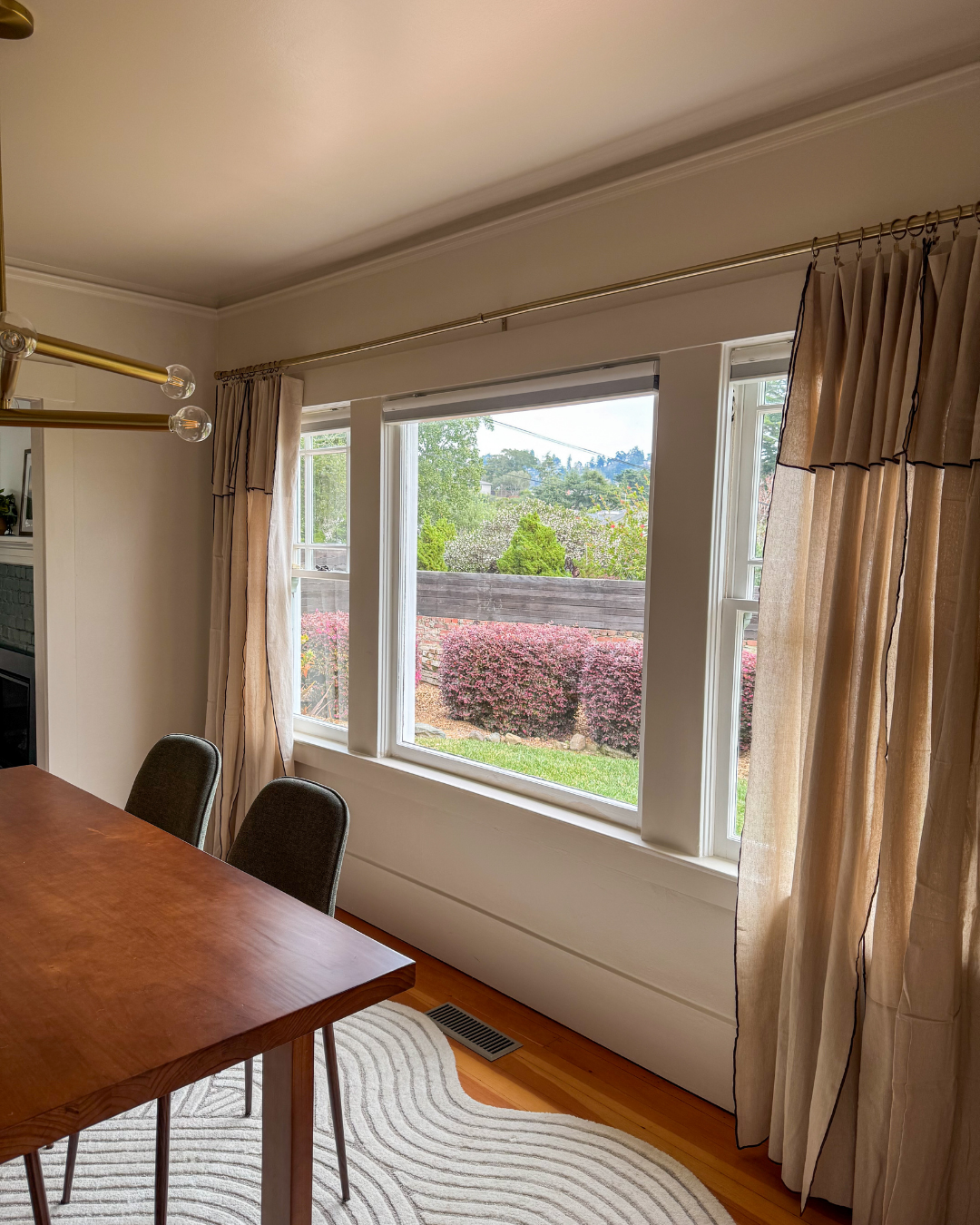
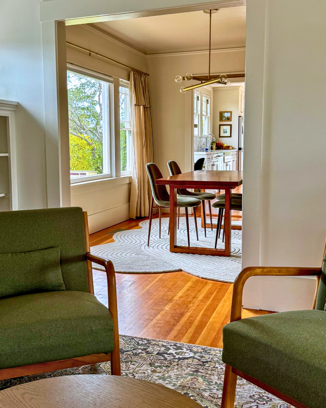
What I love most about our cottage rental is the abundance of natural light featuring double-hung windows with divided panes on the upper sash. The windows provide classic character without sacrificing light - a detail that makes my heart very happy. In the dining room specifically, two of these windows sandwich a large double-hung window that spotlights the pre-existing built-in on the opposite wall.
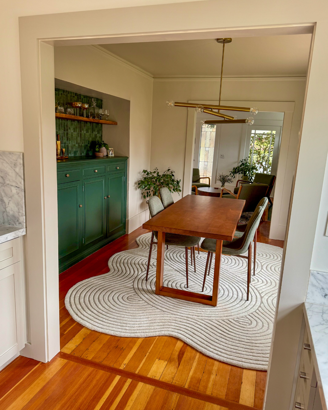
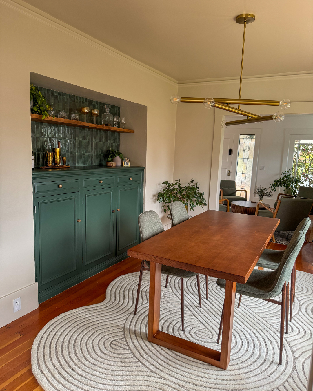
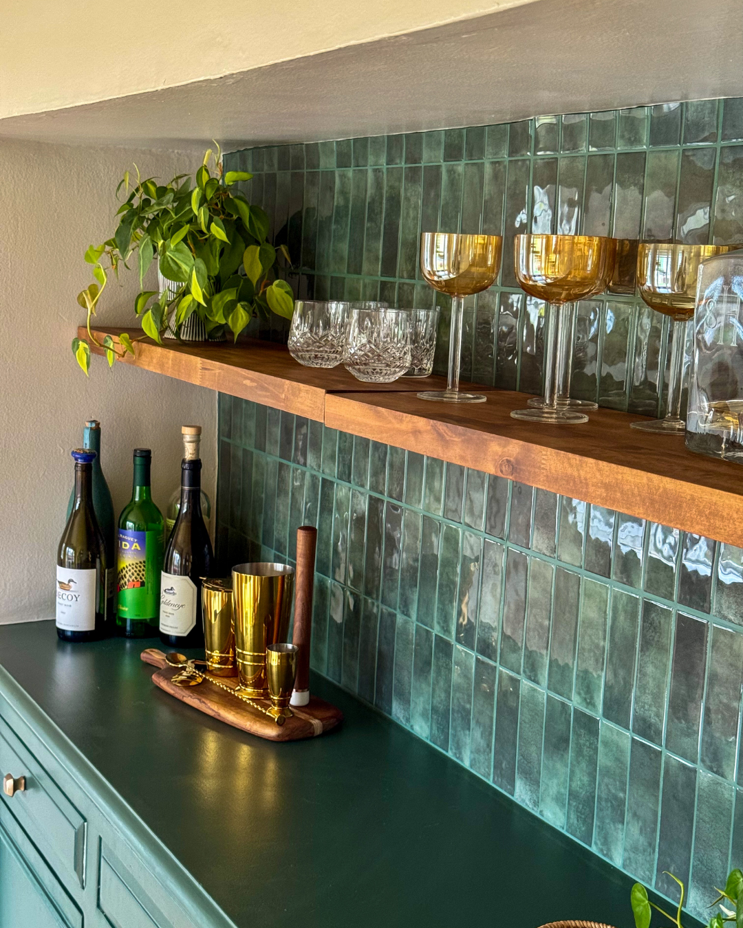
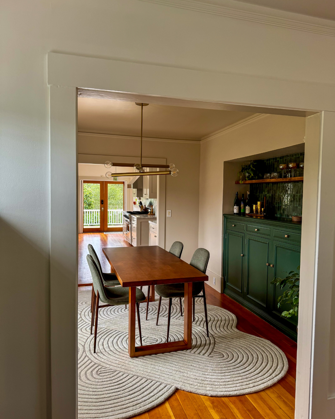
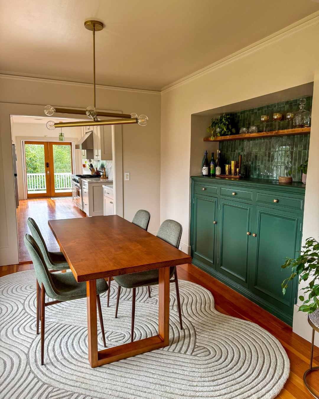
The built-in, rectangle in shape, has 3 cabinet doors, 3 drawers and 2 skinny floating shelves placed above it. We planned to use this as our dry-bar to store our liquor, wine and libation glass collection as Sean and I definitely enjoy a pre-dinner (& post) cocktail.
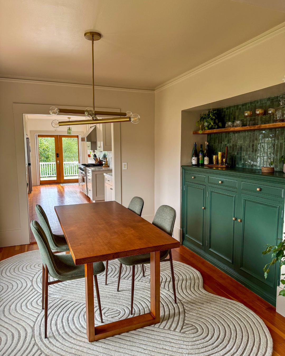
The initial plan for the built-in was to strip the white paint and refinish the wood, but unfortunately it was clear the piece was not built with congruent wood. Originally I had wanted to color drench the room a sage-green to compliment the warmth of the wood, but you don’t always get what you want when updating traditional homes. We settled on painting the cabinet a rich green, and adding a green, peel and stick, subway tile backsplash to make it pop but also remain renter friendly.
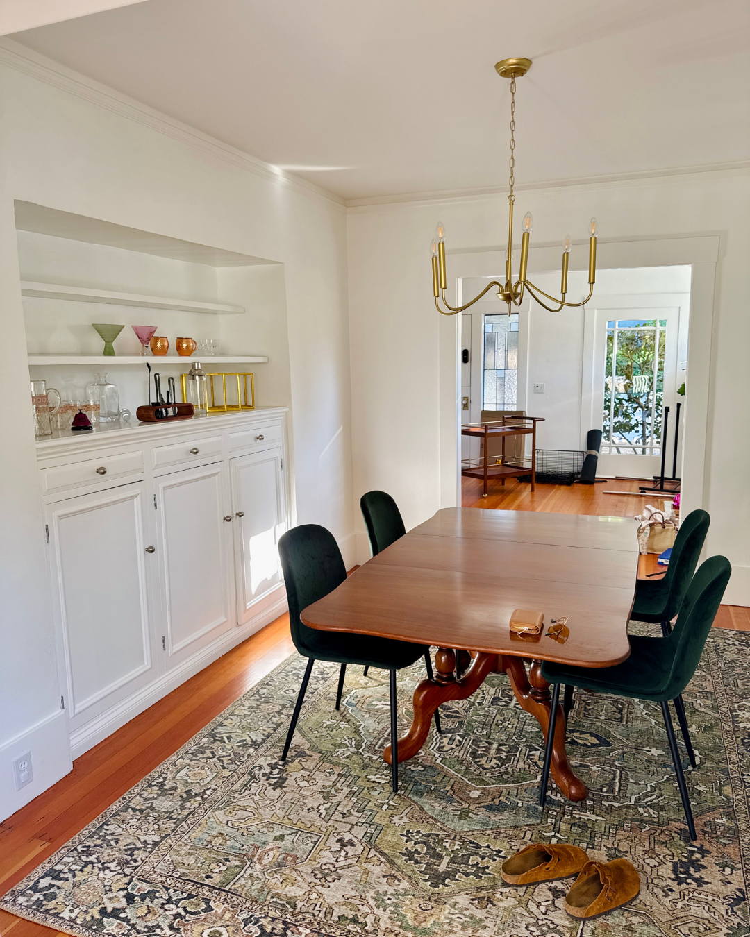

We determined that one larger shelf would be more beneficial for our use as the pre-existing floating shelves were not functional for our needs. We plan to display wine/liquor bottles on top of the cabinet - more specifically our Clase Azul. I love having that bell ready-and-waiting (IYKYK).
After we committed to our built-in color scheme, it was time to choose a paint color for the walls. I was still interested in color drenching the room but I didn’t want it to feel out of place between the adjoining ones. At this point in the design process I decided to make a sitting-area in front of the fireplace that would function as a perfect place to migrate after dinner with a glass of wine. With sightlines into the dining space from multiple angles, the paint color had to be intentional. *Kitchen cabinet paint color enters the chat*
Quick side-story: The very first project I jumped into was painting the kitchen trim. Once I fell hard for the cabinet color, it only felt right to give the door and window trim in the kitchen a moment of its own. The little shift adds just enough separation from the walls and brings a bit more depth and dimension to the space. So I thought - what if I carried that color into the dining room?
With the paint color chosen I began to mull over furniture, lighting and decor ideas with Sean:
Table - Sean and I have very different styles: I wanted a round edge, he wanted linear. We compromised on a solid wood table with clean lines and walnut stain. It draws from the deeper tones of the floor and allows enough room for walking around on both sides.
Chairs - We brought our previous emerald-green velvet chairs to the new house and both admire the shape: simple & traditional. We found a similar style in a lighter-green, linen fabric that compliments the new table nicely. I also like that if we need to bring in two of our velvet chairs for larger gatherings, the two styles will blend well due to their similar shape. We still plan to add two larger chairs to each end of the table - when budget allows.
Light - Initially we both likes a chandelier type lighting fixture. Ultimately I thought the style would feel too grand in the space with its current ceiling height. We chose a more modern light fixture to elevate the space.
Curtains - I still wanted the windows and natural light to be the star of the show so I chose a beige linen curtain that adds warmth but not boldly. I liked the ruffle and pipe-lining detail.
Rug - The room was still lacking movement and ultimately needed a little funk. With hard lines refLected in the built-in, shelf, light and case openings, I wanted to find a rug that would add more softness reflecting in the curve in the chairs. The grooves in the rug were an added bonus to add dimension. For me, it really became the star of the show!
We still plan to add artwork and more decor elements over time. We hope to discover pieces that speak to us and the space directly, and don’t feel pressured to fill a blank wall just because. For now, we look forward to filling the space with new friends, family and many homemade pasta dishes.
The After